
There's a spool in my head, and right now, it's running through a thousand ideas of new approaches as to generating art. Lately, I've been going over alternative ways to use Perlin noise, and especially experimenting with Perlin noise of 3 and more dimensions, drawn down to 2 dimensions again.
The five fields of the above picture each are generated by the same algorithm, which is able to create images such as this:

The pieces are generated from four Perlin noise values.
The first is a completely normal Perlin noise value, meaning that it is evenly distributed and pretty boring.
This value is then used as the 3rd dimension in the three next Perlin noise values, that then are anything but evenly distributed or boring. The rings and other distortions we see are caused by these unexpected swoops and dives through the 3rd dimension.

Here we see first a flat Perlin noise field, whose 3rd dimension is then distorted more and more by a different Perlin noise field. As the distortion increases, quite different strokes turn up.
A way to picture this is to first consider a cube of 3D perlin noise, and then cutting through it. The cut is not flat, though, but has the well-known Perlin noise landscapes of hills and valleys. Now, on the surface of this cut-out terrain, you would see the resulting distorted Perlin noise which works so well for creating strange, melted figures.
The three new Perlin noise values then control the colours, painted onto the screen.
 |
| Low Distortion |
 |
| High Distortion |
The two above pieces happen to have quite similar colours, which makes them good as an example - this, however, is purely by chance. Each piece has four completely random colours, which are then combined using the three distorted Perlin noise values:
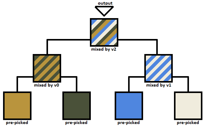
The four colours at the bottom are pre-picked and constant for the whole picture. However, the way they are mixed together depends on these three noise values, termed v0, v1 and v2, which vary throughout the picture. The mix goes in a tree-like structure as shown above. The final mix can be any colour between the four original colours and is output to the screen.
I use the same method for picking colours in Convolutional Art. Four colours controlled by three values - and the colours picked as such:
- Hue: random(255)
- Saturation: 255-random(random(255))
- Value: 255-random(random(255))
At some point further down, by the point we reach the five-field composition, I decided to keep one of the three as black, though, to create more well-fitting compositions. But not yet!


The four colours are, as stated, completely random. This means that sometimes, you end up with very nice compositions, and other times, er...

The success-rate is much higher than expected, though!
Anyway, I spent quite a long time adding as many random parameters to the program to try to see if it could really create some unique diversity. Well... The pieces do look very different, but I do not think any level of random parameters will obscure they are all made with the same method.


Or that's how it used to be, anyway. I continued adding more and more random parameters, and one, especially one above all others, really added a diversity to the pieces:

The parameter we see being changed here is the falloff strength of the noise octaves. Basically, we go from having one strong octave of noise and a couple weak stragglers, to having several octaves on a similar level. This, together with all the other random parameters I added, finally let me reach the desired amount of diversity.
I've talked a bit before about how difficult it is to showcase diversity. Usually a piece of art is just a singular piece, and is presented as such. But almost all that I am working towards has to do with pluralities, several different pieces, their internal diversity, and so-forth. Finally, I settled on this:

It's a bit more crowded, sure - it might be best to click the picture to see it in full size. Apart from this being a stylish composition (I'm a great fan of diagonals), it also affords one to see the diversity in form that is possible. Diversity in shape, in colour, in complexity.

One of the problems before was that sometimes, the algorithm would spit out a kind of boring composition, like the one in the top right part of the above picture. However, holding it together with four other images with more attention-requiring compositions, it is actually kind of nice to have a laid back composition up there in the corner.

There are a lot of extra programming tricks thrown in for good measure. You may have noticed one of them, like in the green area in the bottom left of the above picture. All colours have a diagonal pattern applied to them - though for each of the four colours, this pattern is different. It actually is a bit of a trouble that it is noticable. The point of it is, well... a bit of texture is necessary for everything to not feel too foreign and strange.
If we instead look in the opposite corner, in the top right, you might notice some white lines that accentuate the brush-strokes. They actually exist in all the pictures, just not always so obviously. The goal is to give a feeling that these are actual shapes you are looking at. Similar to the white lines, there are also very faint dark shadows.

The last trick is quite noticeable in the above picture. Sure, the whole trick with 3D-noise does help to create more solid structures, but it only goes so far. Everything ends up a bit too blurry if the colour palettes are not straightened out a bit. To this end, before the values are used for blending together colours as described above, each of them has the sine of itself added to itself. Showing is better than telling. It clears up borders like this:

Okay, .gif compression is really bad here. But anyway, this method creates soft borders between the different colours in the palette. I use it in almost all my projects, though to different degrees.
I think that's about it. Though this project has evolved quite a lot since I started, so who knows, maybe I'll go back again.
Comparing it to Convolutional Art, my primary art project, it is a bit disheartening to see the ways in which this method is superior, especially in its simplicity. However, though I have reached quite a high level of diversity, it still is far from the diversity seen by Convolutional Art.
If you want to generate some pictures yourself, or want to see the source code, it all can be found here:
Awesome!
ReplyDeleteWhat did you use to combine them into a single image? Was it imagemaigck?
Have you considered embedding a video instead?
Are you referring to the five-tile setup? It is done algorithmically, as in, first the pixels of one field is rendered, then new values random seeds and values are chosen, then the next field is rendered. The fields and their geometry is defined by simple for-loops - you might be able to find them in the linked code!
DeleteSorry for the late response