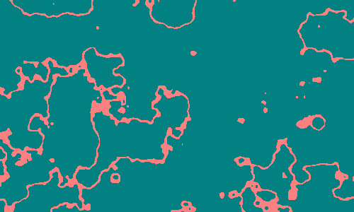
I've talked before about a specific visualisation of Perlin noise, which draws out contours. Earlier I have called it a channel map, because it seems to draw, well, channels. Specifically, it highlights the values close to the median of the Perlin noise distribution. In the oft-used case where Perlin noise is used to distinguish between land and sea, the contour map would be the map of the coastline. This:

I will argue that the contour of the coast-line might be the most interesting part of the Perlin noise. When we look at Perlin noise generated landscapes we automatically move our attention to the coastlines. So let's look at some things this function can be used for.
First, we need to get a feeling for what it is. I held a (wrong) belief for quite a while that it would almost always connect all parts of a map together, like a web of some sort. Instead, if we look at this animation of a contour map through time, we can see that it goes through phases, where, as hoped, it really does become a web, and others, where it stays fragmented.
It surely does create some interesting patterns, and it has a certain affinity for making

Here, the background for the Grass type cards shows off a pattern you will recognise as being a Channel map. The same is done for Poison type, only in purple - and perhaps it is most applicable in the case of Poison.


I will argue that the contour of the coast-line might be the most interesting part of the Perlin noise. When we look at Perlin noise generated landscapes we automatically move our attention to the coastlines. So let's look at some things this function can be used for.
First, we need to get a feeling for what it is. I held a (wrong) belief for quite a while that it would almost always connect all parts of a map together, like a web of some sort. Instead, if we look at this animation of a contour map through time, we can see that it goes through phases, where, as hoped, it really does become a web, and others, where it stays fragmented.
It surely does create some interesting patterns, and it has a certain affinity for making
- stringy bits
- areas with holes in them
Also, the lines it draws are neither gentle or soft - instead the lines are almost always twisted, like something unnatural or something in pain. I have used this as inspiration myself for when I used it for the PokeHearth project:
However, I also created a version where the x-coordinate has been stretched, which creates a very simple yet quite effective replica of Electricity. If it looks a bit too obvious, remember that most of the card is obscured with other stuff:
As the contour map is quite contorted in its natural state, it might be necessary to augment it depending on your purpose.
The contour map, is, of course, closely related to taking the modulus of a Perlin noise value. Nobody says we only have to look at the coast-line. We might instead look at a cut through an altitude of say, a hundred meters, or we might look at both. This happens, however, to be the exact same thing known as the contour lines on topographic maps. It seems we have gone and invented sliced bread yet again.
Wow that's way too crowded to look at when shrunk down. Better click to see it full size unless you want your eyes to burn. Anyway.
There are some important properties these lines have. First is that all lines in the contour map draw out complete figures. Sometimes these figures are actually several figures in one, sometimes they're hardly big enough to have space inside of them. Nonetheless, all of them are complete shapes - never does a line end without meeting up with itself
The other detail is an extension of the first - a line will only ever meet up with itself, and never any of the other lines (unless the resolution is too low), meaning that it is the outline of a shape. It also follows that a higher level shape will always be encompassed by a lower level shape - that is, until you reach the ultimate level, that of the original channel map.
So these are nested Russian matryoshka dolls, but with the strange property that the first doll holds two different dolls - one for values above the mean, the other, for values below. Also, there is an arbitrary number of dolls later on, and really, the metaphor is a mess, so never mind all this.
We do, however, have some extra options. The illustration earlier not only uses several lines, it also made, specifically, several horizontal lines displaced vertically. This can be done as easily as adding the y-coordinate to the Perlin noise before taking the modulus.
This, however, breaks up the shape-creating abilities seen in the earlier incarnation. Too bad! It comes, however, with the benefit of much more predictable outcomes. One can try being a bit creative and do something like this, for instance:
If you needed to do tree growth rings for some reason, there you go, just substitute the y-coordinate with the distance from the centre of the image. Neat!
A couple of months ago, I made a piece which utilises both the radius and horizontal lines of the above images. Here, the distance from centre controls how strong the Perlin noise is at any given point. The piece looks like this:

A couple of months ago, I made a piece which utilises both the radius and horizontal lines of the above images. Here, the distance from centre controls how strong the Perlin noise is at any given point. The piece looks like this:
Still, there are more options. I want to show a last usage of this method. Nobody says you have to stay with just a single line - using two diagonal lines instead will instead allow you to create webs, that are guaranteed to connect all parts of the image, no matter how gnarled you make them:
Here, the same map that distorts the lines is also used to control altitude. This is actually the map of a planet, which in full would look more like:
In conclusion, we really did come a long way from the start where we were simply looking at coast-lines. From the coastline, we went to contour lines, to distorted lines and geometry allowing us endless possibilities of expressions. The sky's the limit. What other ideas does this give you on what to use the contours for?
Comments
Post a Comment