This will be the first of three (four?) posts detailing the process of programming a convolutional art generator. For the results, take a look at these Newer pieces or Early pieces.
This started as an “I wonder if I can…” and at this point, it’s a thing on its own. I believe I’ve managed to take a stab at the dark and pulled out a sui generis creator. It is, through and through, random,, and that's what makes it so powerful. Sometimes, it repeats itself. But I still have not run out of diversity.
And what I’m startled by is how it can be so simple to wrangle art out of thin air. It is basically an uncontrollable mix of different elements and methods, whose sum is more than the parts. It could have ended up terribly. But I am quite happy with the results. And the biggest result of all is what this work has taught me about esthetics.
Humble beginnings
Let me take you back through the history, to the very first beginnings.
I always knew what the goal was: to create an algorithm that could create several different pieces of art. So in the beginning, I just rendered images pixel by pixel, inputting the last three layers of the convolutional network as RGB values of the colour.
At first, I was not quite aware of the importance between the colour of one pixel and its neighbours. While this relationship is obvious when painting with a brush, with my chosen approach, it was impossible for one pixel to know what its neighbours were doing. This meant that if the input was not related to coordinates, neither was the output:
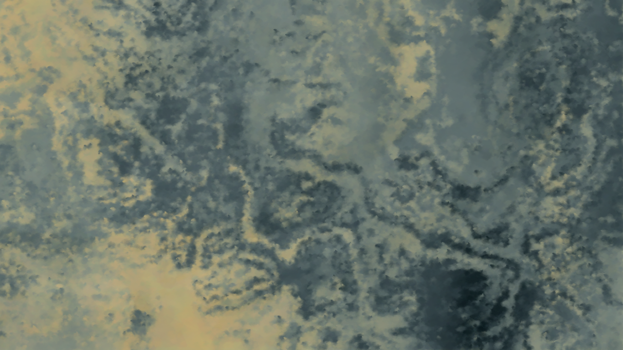
The grain is not as important as one might think. Rather it is the lack of any other discernible structure - the grain can be accepted in the two left pictures. They just are not very interesting.
So the goal was on one hand to make stricter links between the coordinate and the colour, and on the other, to avoid results like this:
Finding input
In the beginning, I wasn’t very aware of the importance of space. I decided on a simple approach: In scanline, for every pixel, find a colour. The colour was picked from:
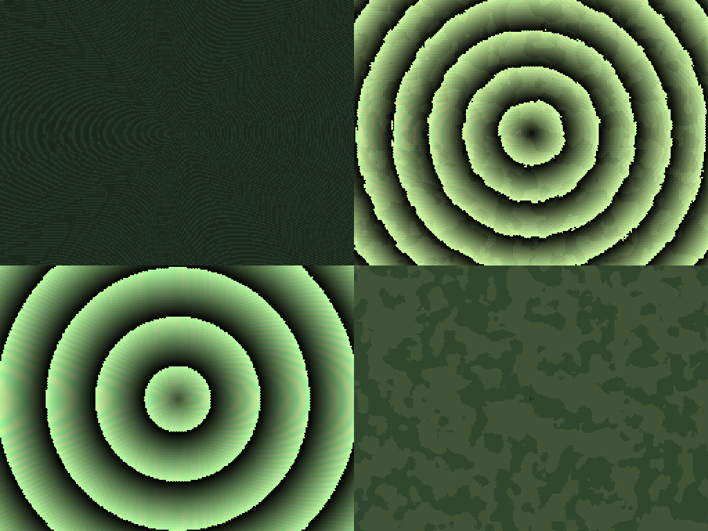
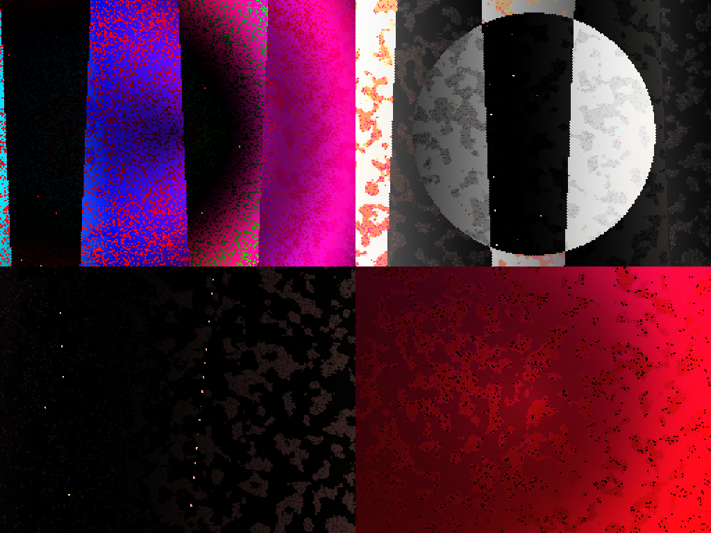
10 input channels, which at the start included X, Y, distance from centre (that’s where we get the concentric circles), a completely random number, and three constants that were to supply the difference between the four different images.
20 neural layers. These layers (or convolutions as I choose to call them) are simple functions that take in a number and spit out a new one. The numbers are pulled from previous layers (input and other neural layers), and the functions are adding, subtracting, modulus, sinus, etc.
Three output channels, that supplied respectively the red, green and blue value of the output pixel, perhaps applying modulus or max/min to keep it within the 0-255 range.
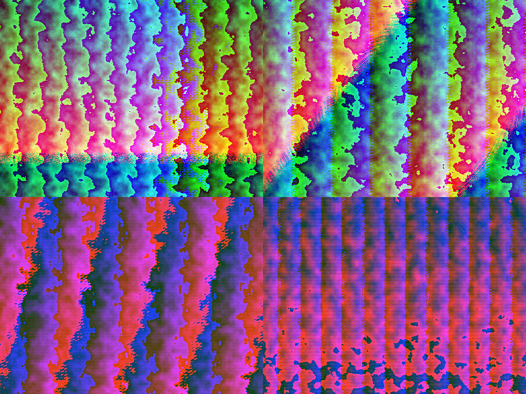
This method was and is incredibly flexible. It’s also pretty difficult to fine-tune. I think I went more than halfway through the process before I even coded up to be able to see these layers, where I noticed that a lot of them would go far beyond the intended 0-1 range, like how I accidentally forgot to divide the X and Y values by the width and height of the picture.
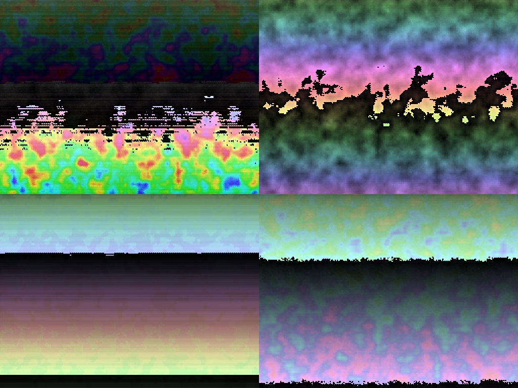
This might be why the first pictures seem really glitchy - because they were. If the input of the Y coordinate reached the outputs at all, it would dominate the whole picture, like in above. But still, you can see the insane flexibility of the rule-approach. It is just so limited in other ways.
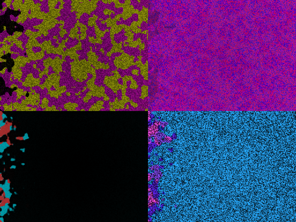
Removing the glitched X and Y coordinates left the pictures looking noisy or straight up replications of the perlin noise layer. Because one way or another, there needs to be a spatial relationship within the picture. Without composition, no painting.
But this is the other extreme. Circles, straight lines. It looks incredibly artificial. There is an aesthetic, but just one, which comes through with the neon colours and the pixel rendering as well. A change had to be made. Nonethelss, this piece is one of my favourites. I regret not having lived through the 70′s - this is how I imagined they looked.
Next post will take us from the base idea on to something that looks a bit more like art.