This is the second of three (four?) posts detailing the process of programming a convolutional art generator. For the results, take a look at these Newer pieces or Early pieces.
Where we left off, I was reaching some issues with aesthetics. It was difficult to translate the three independent colour channels into one cohesive picture without looking neon and retro. At that point, sinus and modulus was used to break up the monotony, but that looked unnatural, too. So this was when I did the first major change of the program. Going from digital colours to something more akin to pigment coloration, and rooting out the computer-looking math functions.

So perlin noise is pretty great, right? What do you do if you can recognise it as perlin noise, I mean, painters don’t have a perlin generator on their brush. You just stack as many different layers of perlin on top of each other as is needed until you can no longer see what the computer does. But there is a feeling of it just being random paint-splotches.
Whereas the "digital method" had three channels that either controlled:
- Hue
- Saturation
- Value
or
- Red
- Green
- Blue
The "pigment method" also started out with three channels, controlling four pre-defined colours:
- Blend colour A and B. Zero meaning A, one meaning B, and 0,5 being midway between
- Blend colour C and D. Zero meaning C, one meaning D, and 0,5 being midway between
- Blend colour from the two above. Zero meaning the mix of A and B, one meaning the mix of C and D, and 0,5 being midway between the two mixes.
That’s not the full story, as you can see if you look at the bottom right. Four extra channels go on top of the three pigment channels, which offset the red, green, blue and ‘black’ of the final colour. With some tuning, these channels make sure the pigments don’t look flat.
The next rewrite removed us from pixels altogether, and while doing this, I also removed the four-way quartering of the algorithm, giving much greater space for the brush-strokes that were the replacement.

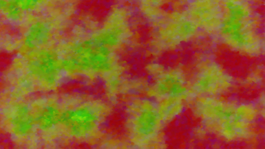
Did you know that it is quite easy to create something that feels like brush strokes instead of digital polygons? You just stack the polygons on top of each-other. Irregular, noisy polygons, small enough that you can’t see that that is what is going on. So instead of drawing individual pixels, for each region of 10x10 pixels, one splotch of polygons is put down, coloured according to the same rules as before.

In this one, where the natural noise is quite orderly, you can see that I added a bit of noise in the colours of the polygons to hammer home that this is paint, not smoke. Later on, I would create three different versions of the paint-brush - a pointillistic one with small points and high colour-noise, an impressionistic, long-brushstroke style, and finally, an intermediate. Later on again, I would interpolate between these. Basically, working with brush-strokes open a lot of possibilities for control as well as random diversity.
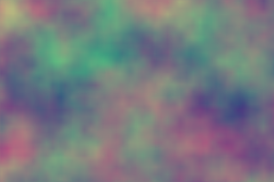
Anyway, if I keep pasting in images like this, you will soon start to realise that everything looks somewhat the same. This is why I needed to rely less on perlin noise, which is the same for all paintings, and more on random neural calculations, that is, convolutions. Strangely enough, the best way to do that was with more perlin noise maps.
Thing is, if you input the X and Y coordinate into a perlin noise function, things will look quite uniform, but that’s because the X and Y coordinates you supplied are uniform. So what if you feed one noise map into another noise map?
Say you have a flat high-value area A and a flat low-value area B, with some hills and valleys in between of medium values. If you call a noise map on area A, you’ll get some nice, sweeping inclines and declines, quite soft terrain, since you basically input the same value again and again. The same goes for B. But the area in between - perhaps it will have the same ridges and rivers as the original, or maybe it won’t - it combines the terrain pulled from with the terrain of the perlin map in a new, unique way.
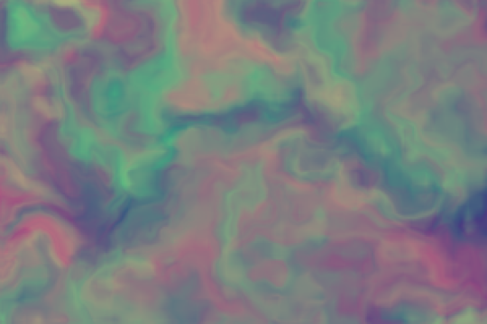
Okay, I think this will be easier to explain visually.
This is an example of a 2-channel perlin map being put into itself again and again.
With uniform X and Y, we get a uniform image. How bland and boring, so uniform. Yawn.
After inputting the result of the first map into the next just once, it is starting to look like actual terrain. I should also point out that it runs the same map again and again, no randomization, only the effect of different layers interacting.

Now, I think this would be a logical place to stop. But let’s take it for a couple of generations more.

It’s starting to lose its feeling of being natural again. It looks the same as the above, but if you pick one point and compare, you will see that things are actually still changing a lot.

I skipped a generation. Anyway, we are also just reaching the limits of the resolution of the small program I made to show the examples.
The point of this is to show that Perlin noise can be used to create more interesting textures when you supply it with non-uniform coordinates. Luckily, all the neural layers give us such non-uniform values to add to the Perlin noise.
The point of this is to show that Perlin noise can be used to create more interesting textures when you supply it with non-uniform coordinates. Luckily, all the neural layers give us such non-uniform values to add to the Perlin noise.